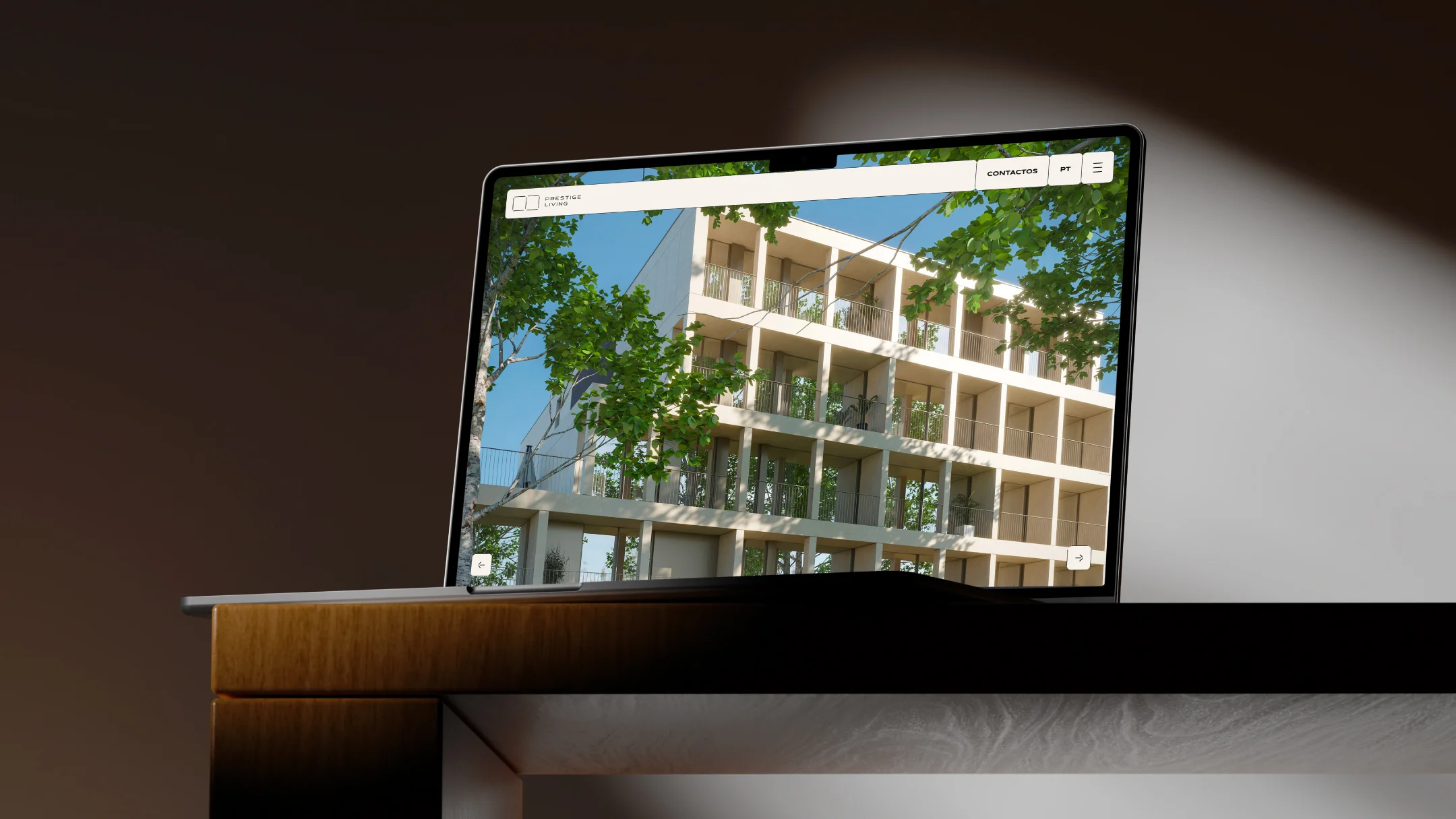
Prestige Living
Porto, 2026
Central, yet liveable; connected, yet serene.
Description
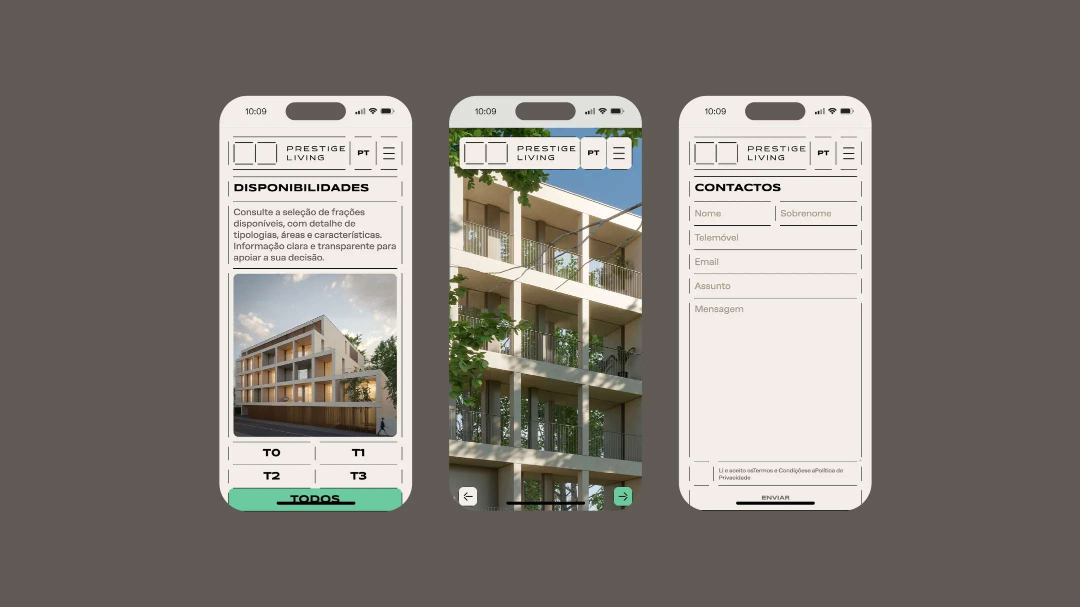
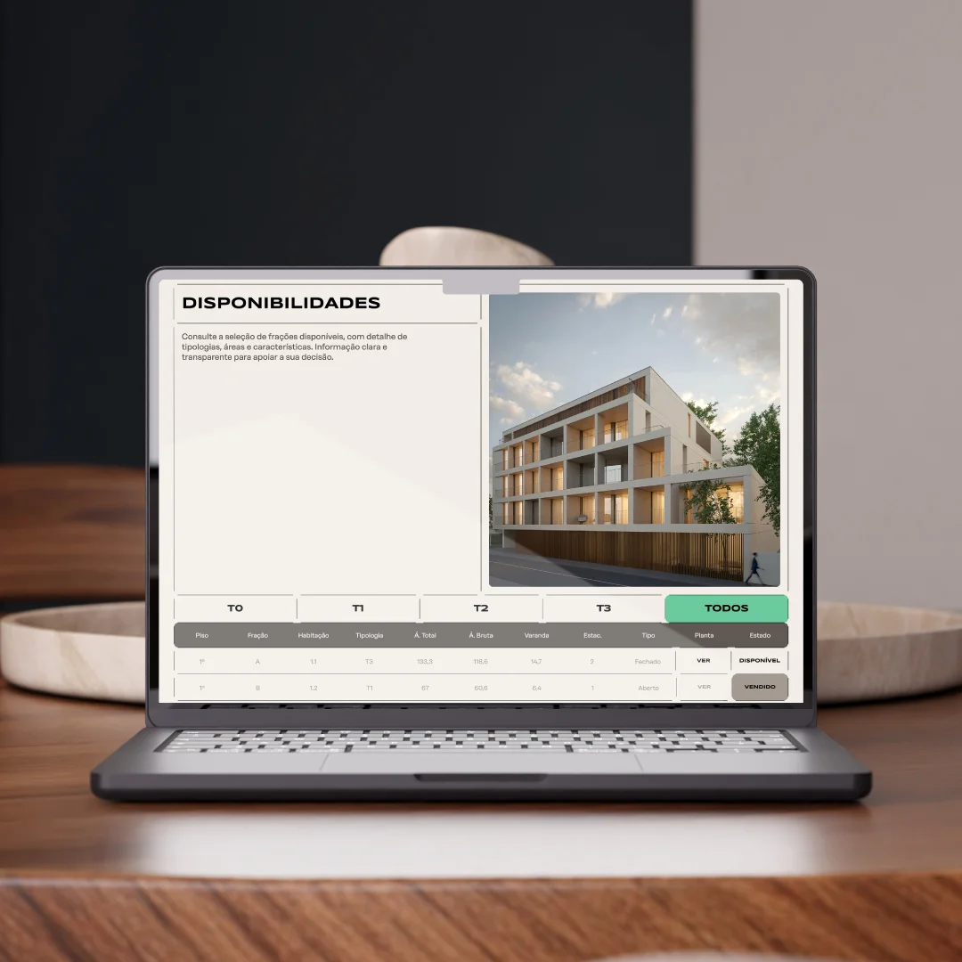
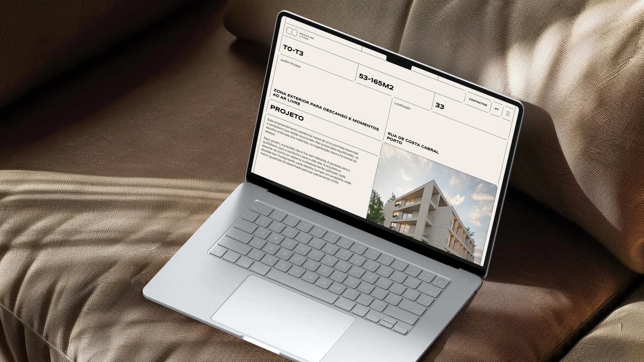
For Prestige Living, we developed a digital presence focused on presenting the development and making its residential offering easy to explore. The website combines a visual language aligned with the project’s identity with information on apartment types, individual units and availability.
The experience was designed to create a smooth flow between visual content and commercial information, making it easier to explore the different options and access details for each unit. The result is a clear presentation of the development that also directly supports the contact and sales process.
-
Pantone 4259 U
R: 95
G: 89
B: 84#5f5954

-
Pantone 7575 U
R: 136
G: 112
B: 90#88705a
-
Pantone 345 U
R: 107
G: 203
B: 157#6bcb9d
-
Pantone Cool Gray 1 C
R: 217
G: 216
B: 214#d9d8d6