ON Apartments
Porto, 2025
Simple Stays, Real Experiences.
Description
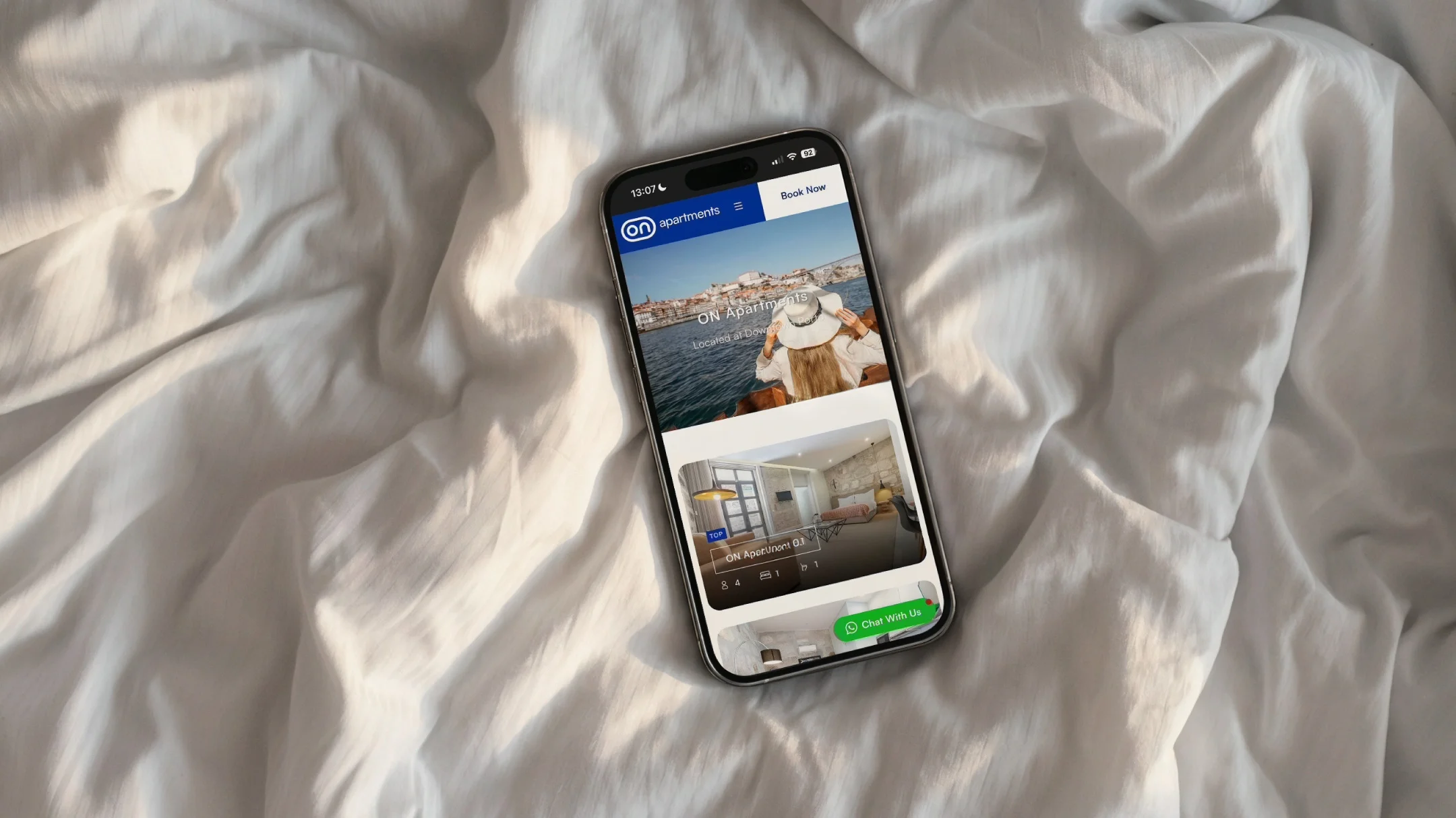
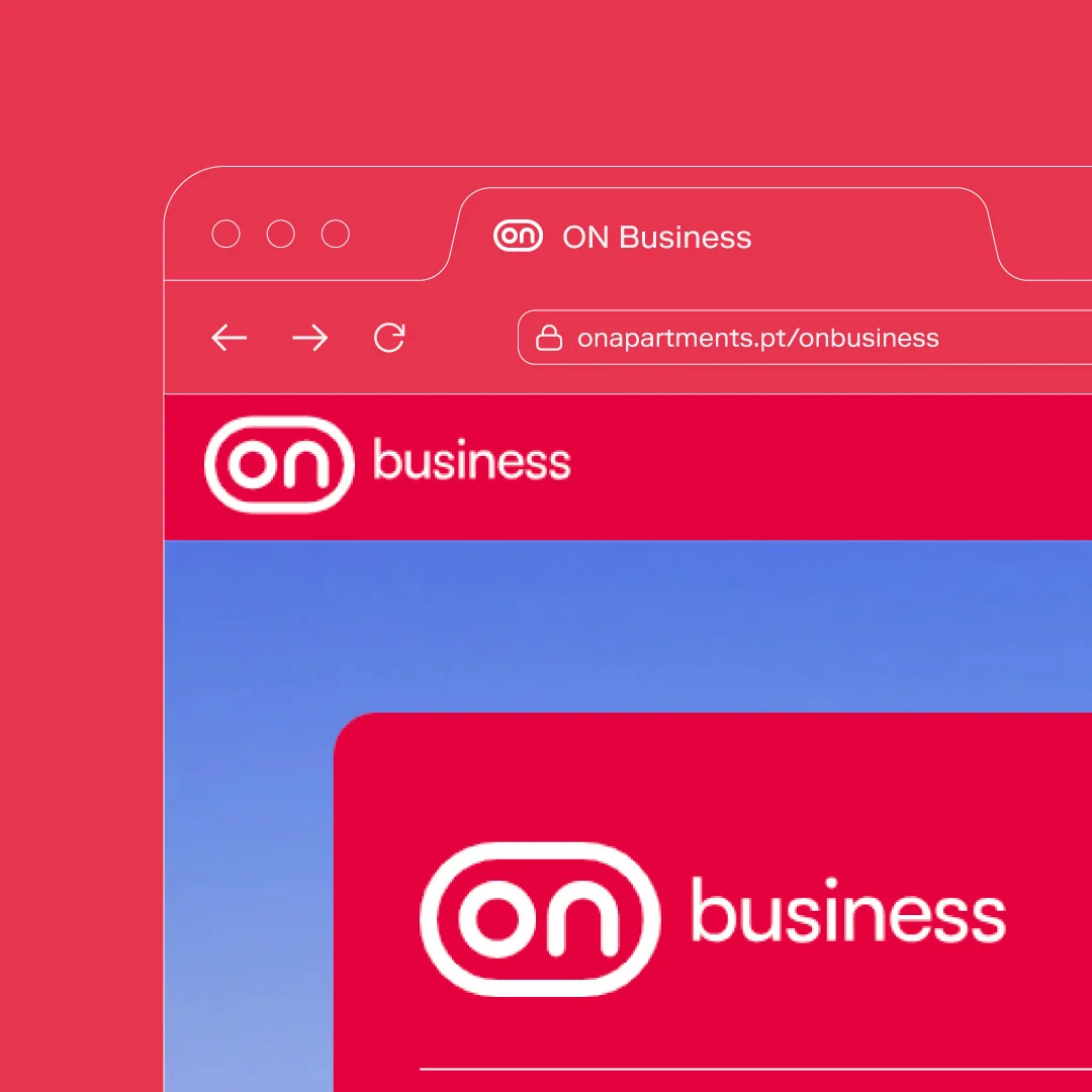
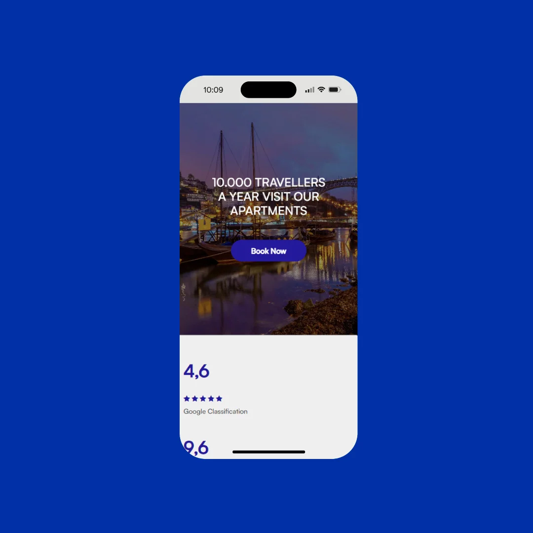
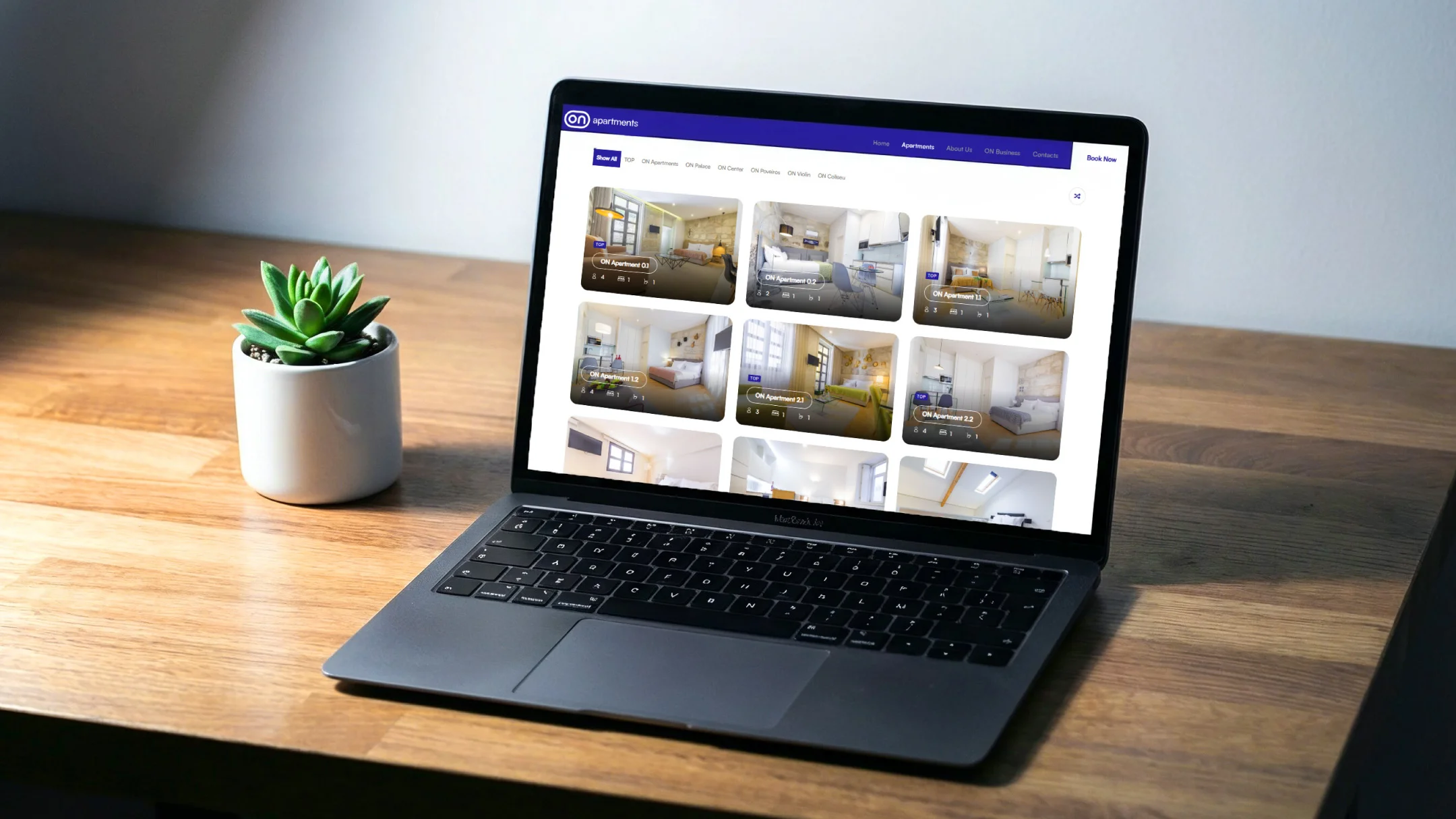
The ON website presents a company focused on managing accommodation located in key tourist areas. The platform is structured into two distinct sections, clearly differentiated through blue and red colour codes, ensuring simple, intuitive, and straightforward navigation. The layout adopts a vibrant, direct, and functional visual language.
The ON Apartments section, identified by blue, is centred on the guest experience, promoting accommodation strategically located near tourist attractions. ON Business, represented by red, is aimed at property owners seeking to maximise their investment with confidence, through a management model that is simple, efficient, and hassle-free.
-
Pantone 286 C
R: 0
G: 51
B: 160#0033a0

-
Pantone 2347 C
R: 225
G: 59
B: 75#e13b4b
-
White
R: 255
G: 255
B: 255#ffffff