Seriporto
Porto, 2020
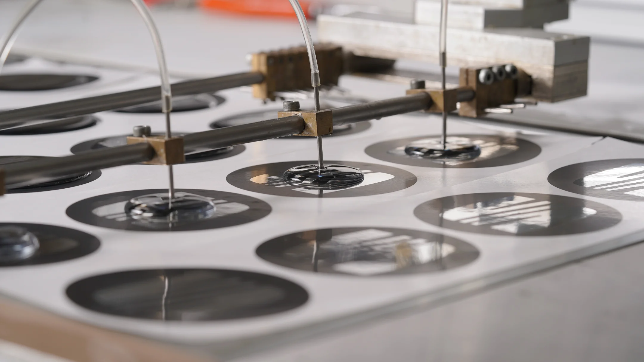
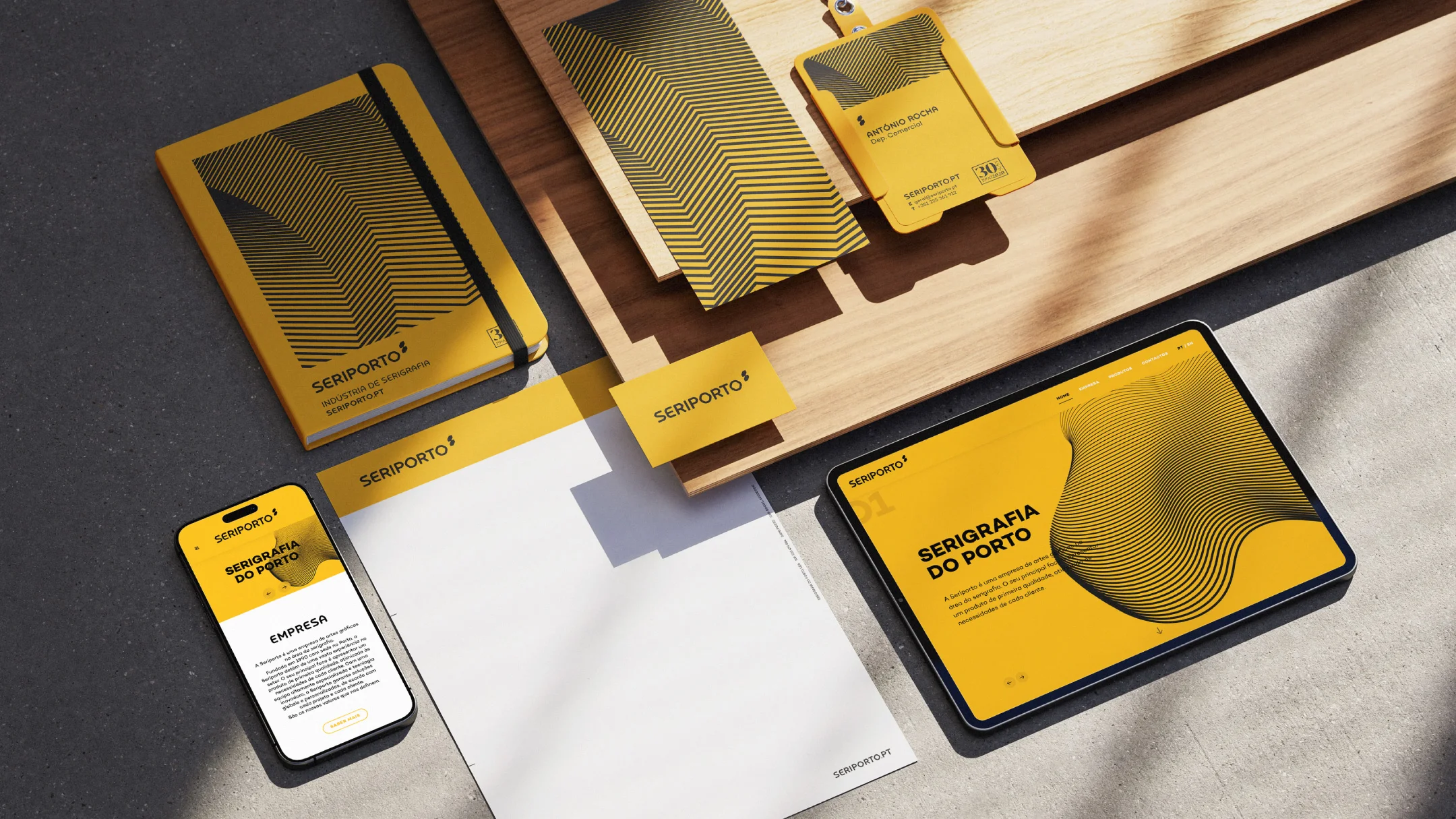
Screen Printing of Porto
Description
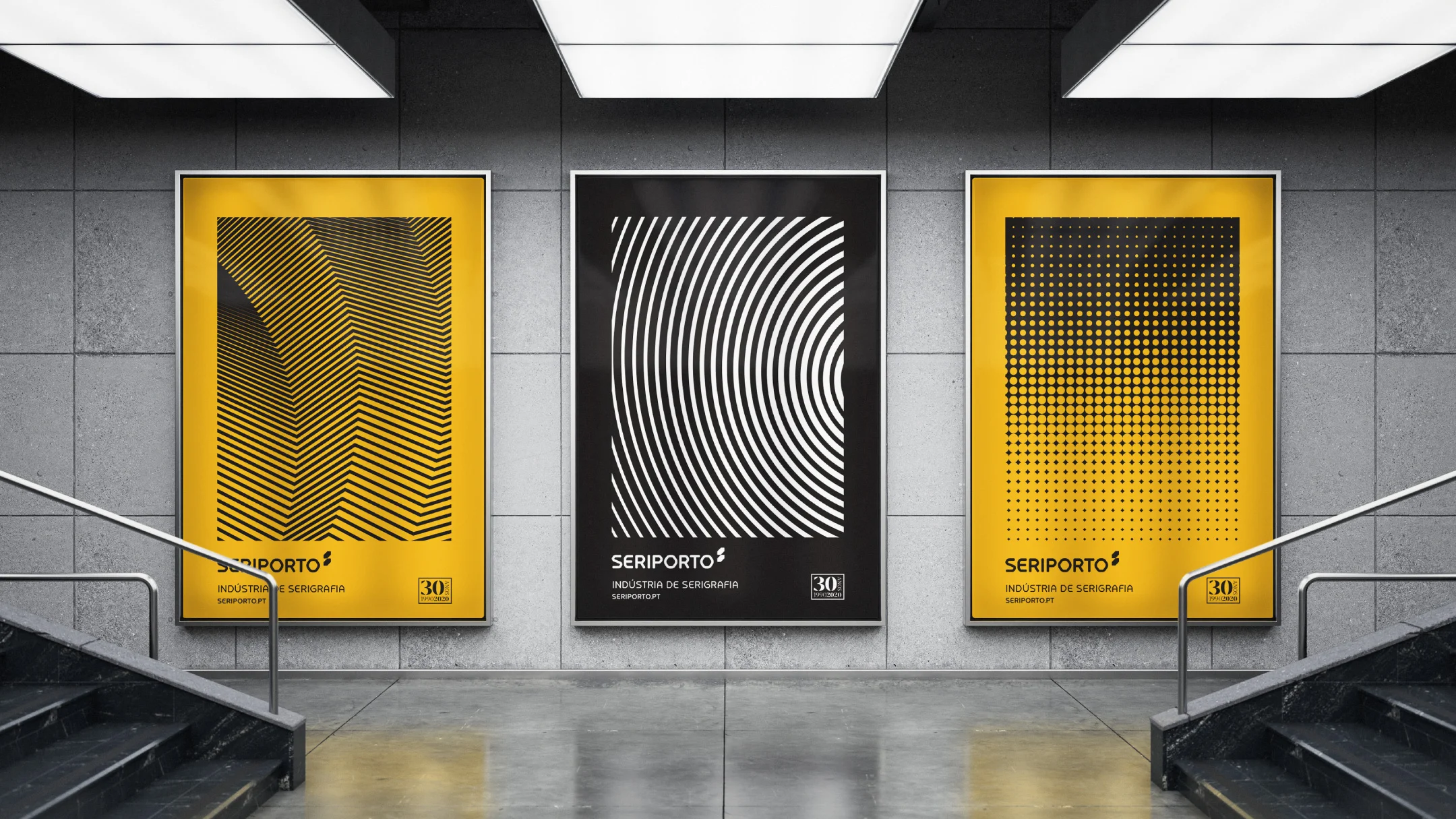
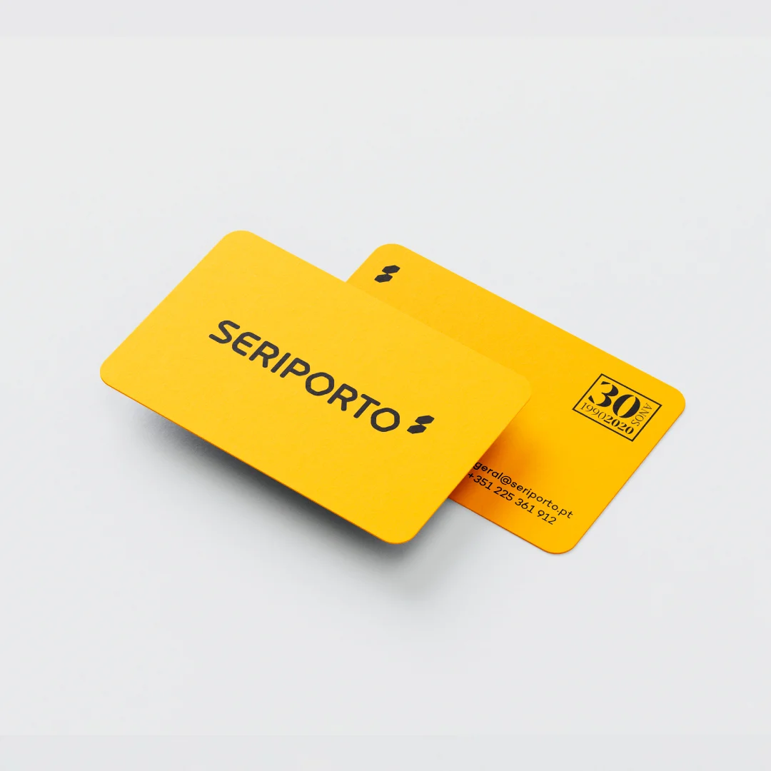
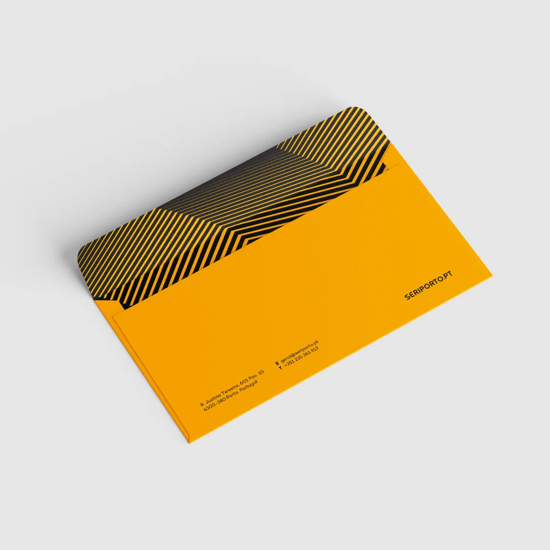
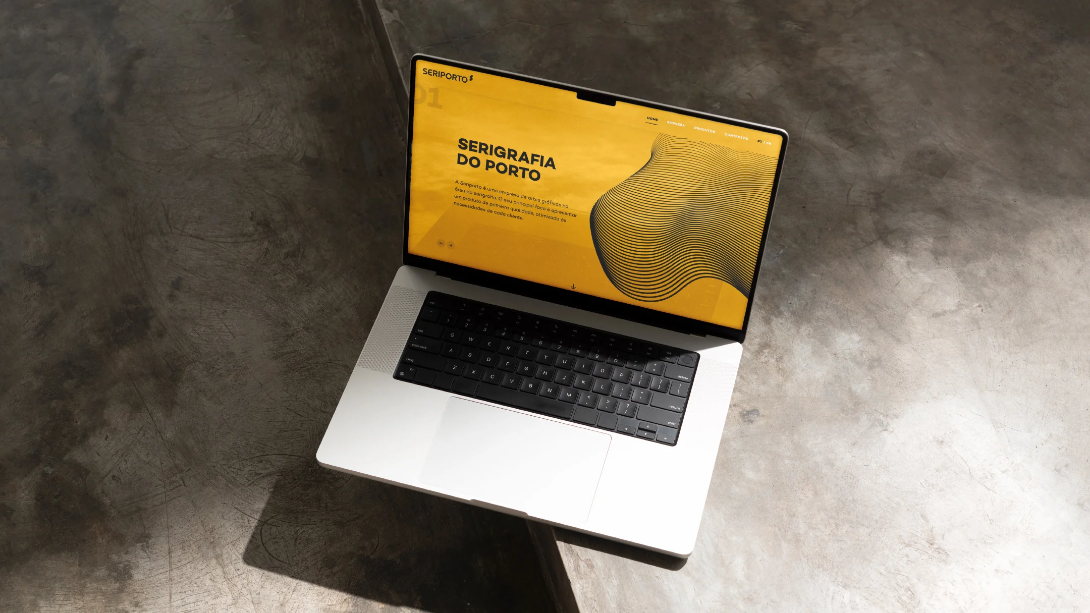
At 30 years, Seriporto undergoes a rebranding that marks a new chapter in its history. With a contemporary image, the new branding emerges as more refined and distilled, embodying the company’s experience and quality. The unique typography draws inspiration from the mechanics and precision of the industry, strengthening the connection between visual identity and its field of expertise.
-
Pantone 1235 C
C: 0
M: 24
Y: 78
K: 5R: 241
G: 182
B: 52#f1b634

-
Black
C: 0
M: 8
Y: 5
K: 85R: 39
G: 36
B: 37#272425