artcase
Porto, 2020
Ballet & Contemporary Dance School
Description
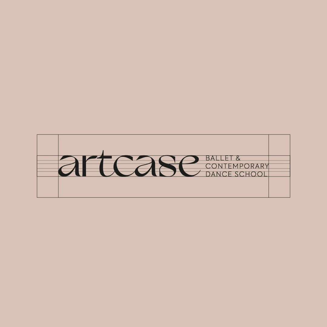
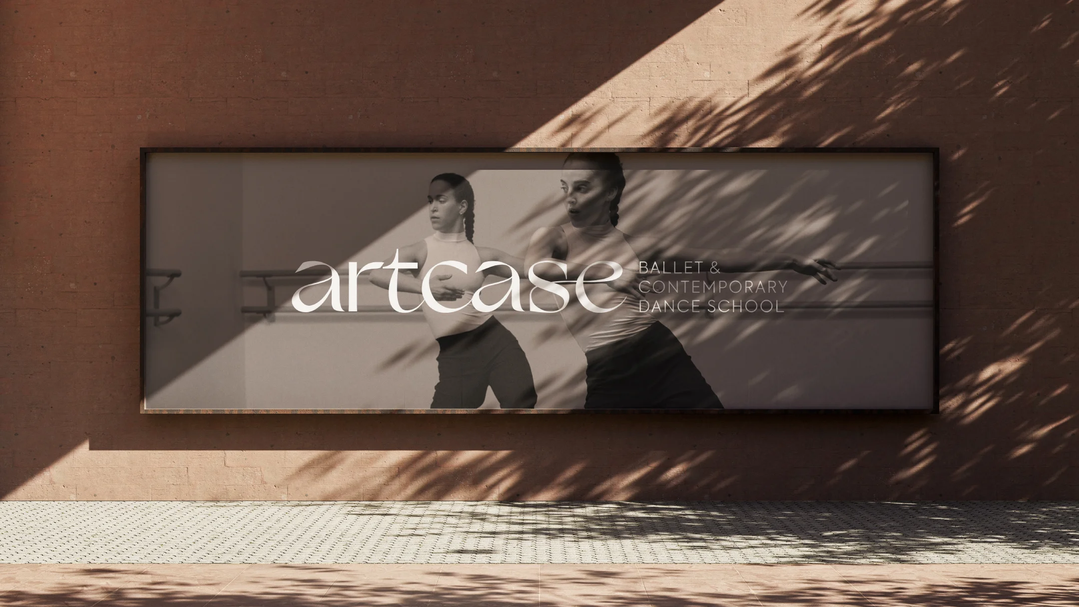
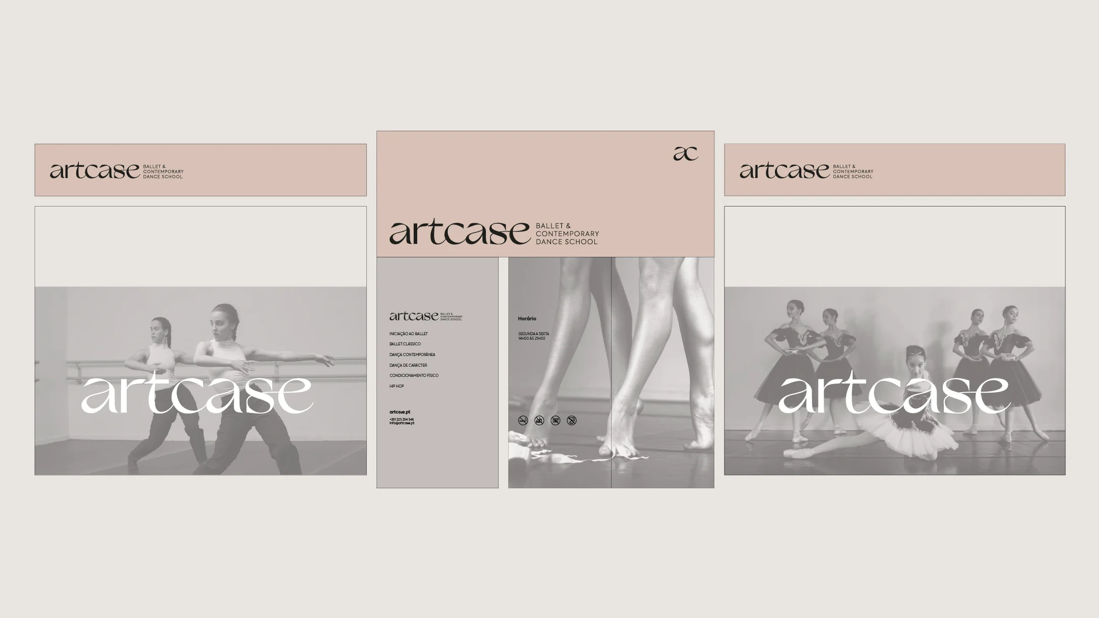
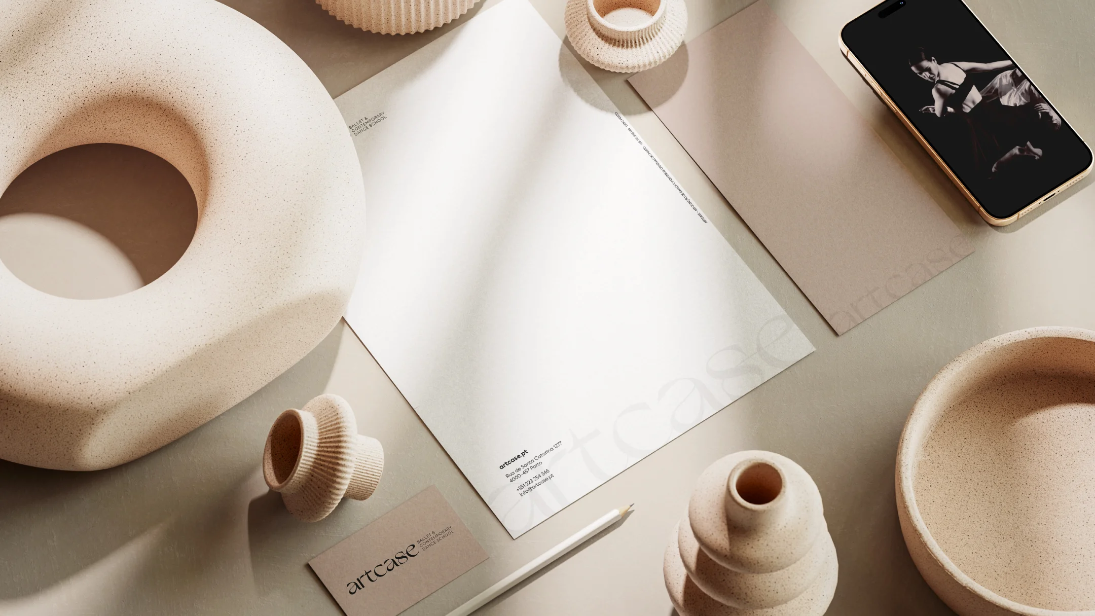
The identity of Artcase, Ballet & Contemporary Dance School was born from the inspiration of movement. The letters interconnect like the gestures of a choreography, flowing in continuity just like bodies in dance. Each stroke was conceived as a choreographed motion, balancing technique and expression. Minimalist and assertive, the branding reflects the delicacy and sophistication for which ballet is known. The color palette, inspired by traditional ballet attire, embraces a vintage pink/rosé beige tone, enhancing the brand’s timeless elegance.
-
Pantone 4755 C
C: 0
M: 9
Y: 14
K: 16R: 214
G: 194
B: 184#d6c2b8
-
Black
C: 0
M: 0
Y: 7
K: 89R: 29
G: 29
B: 27#1d1d1b
