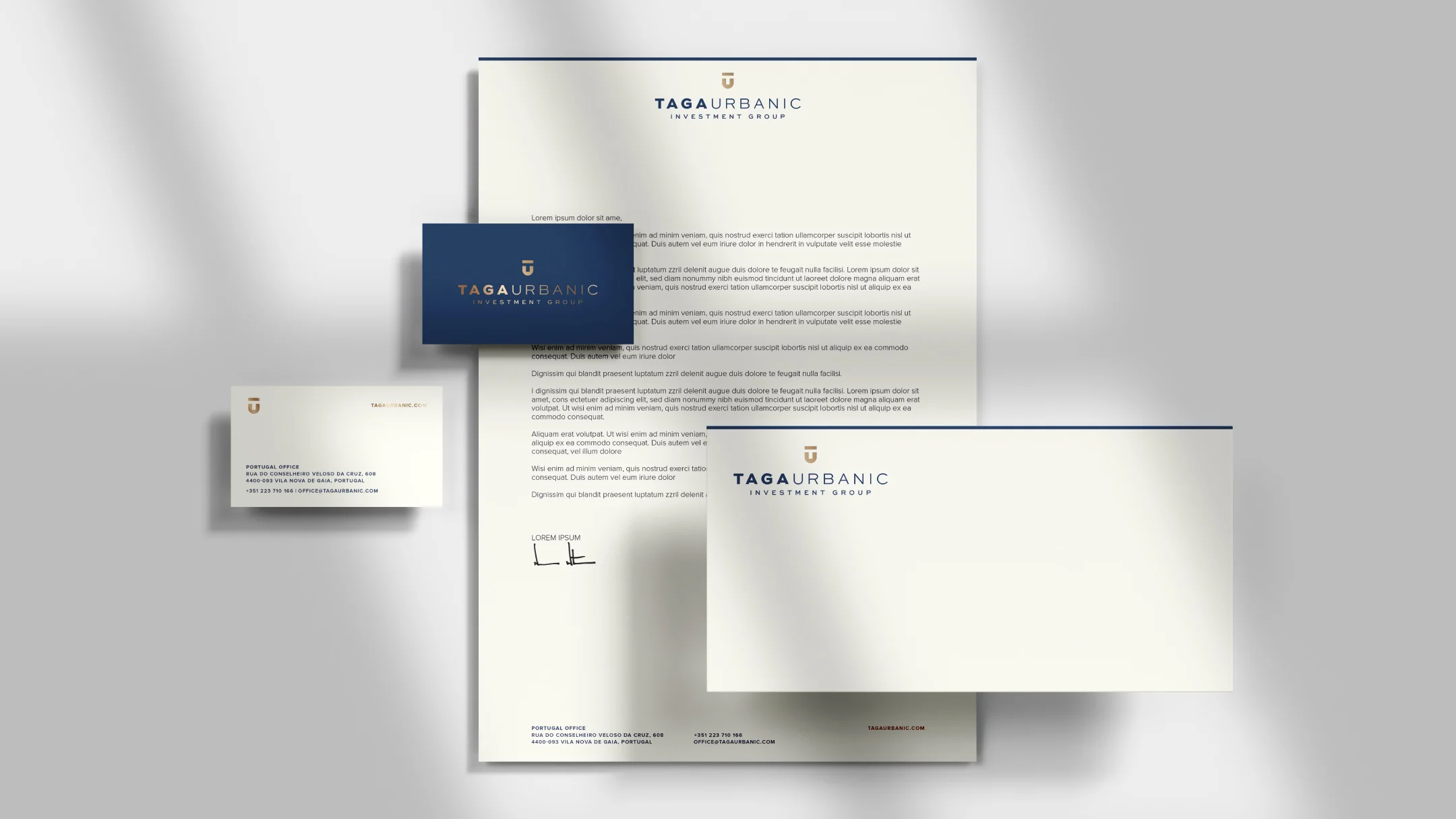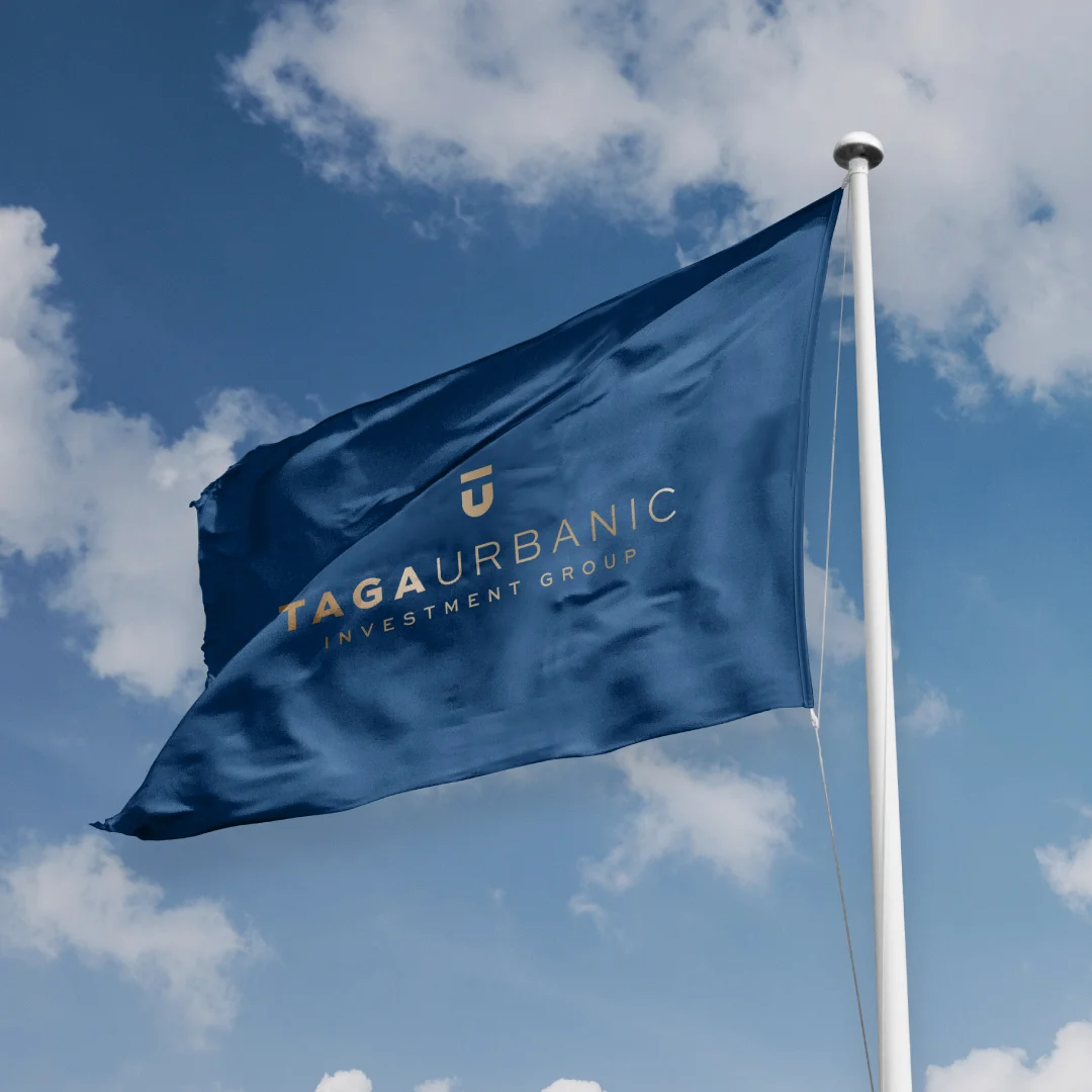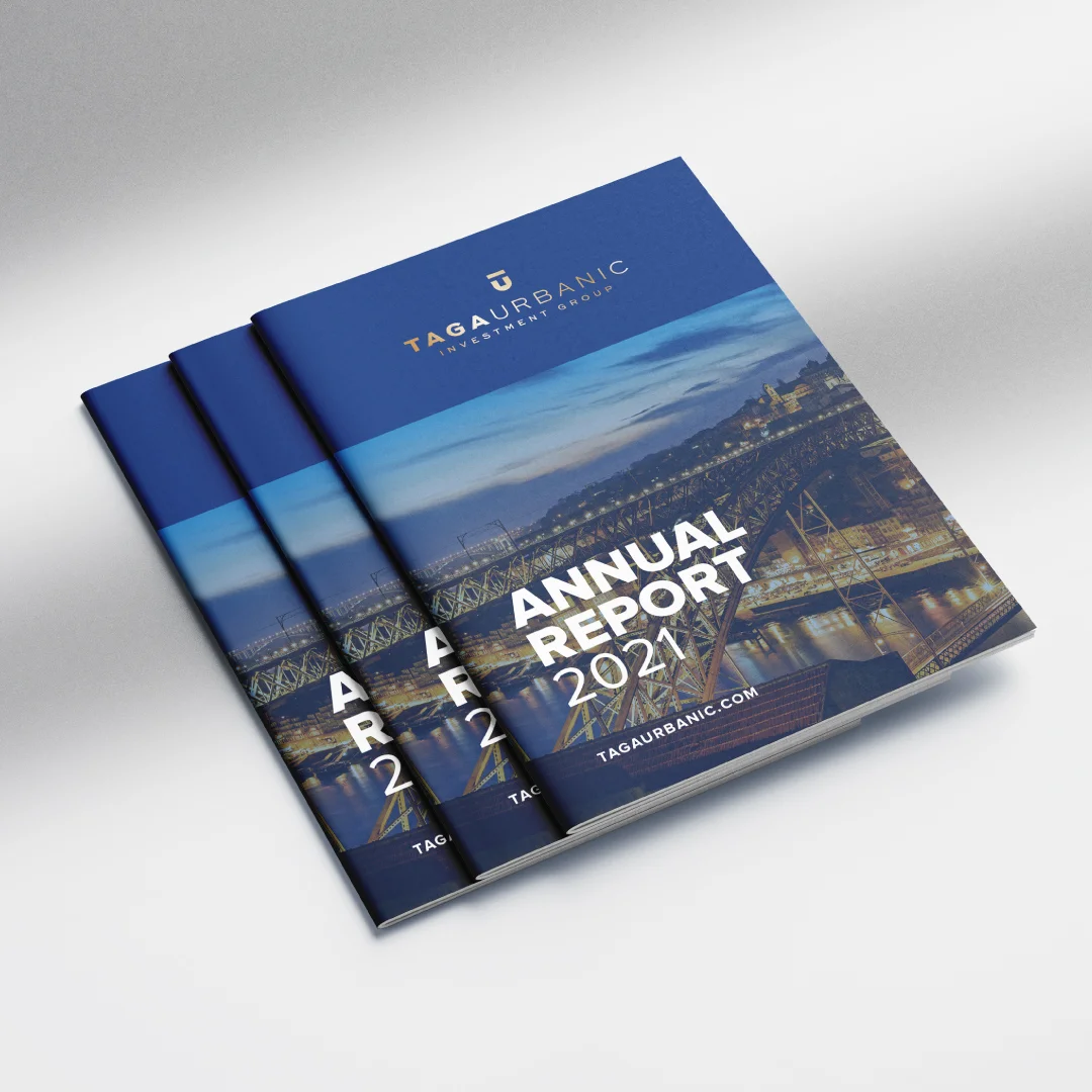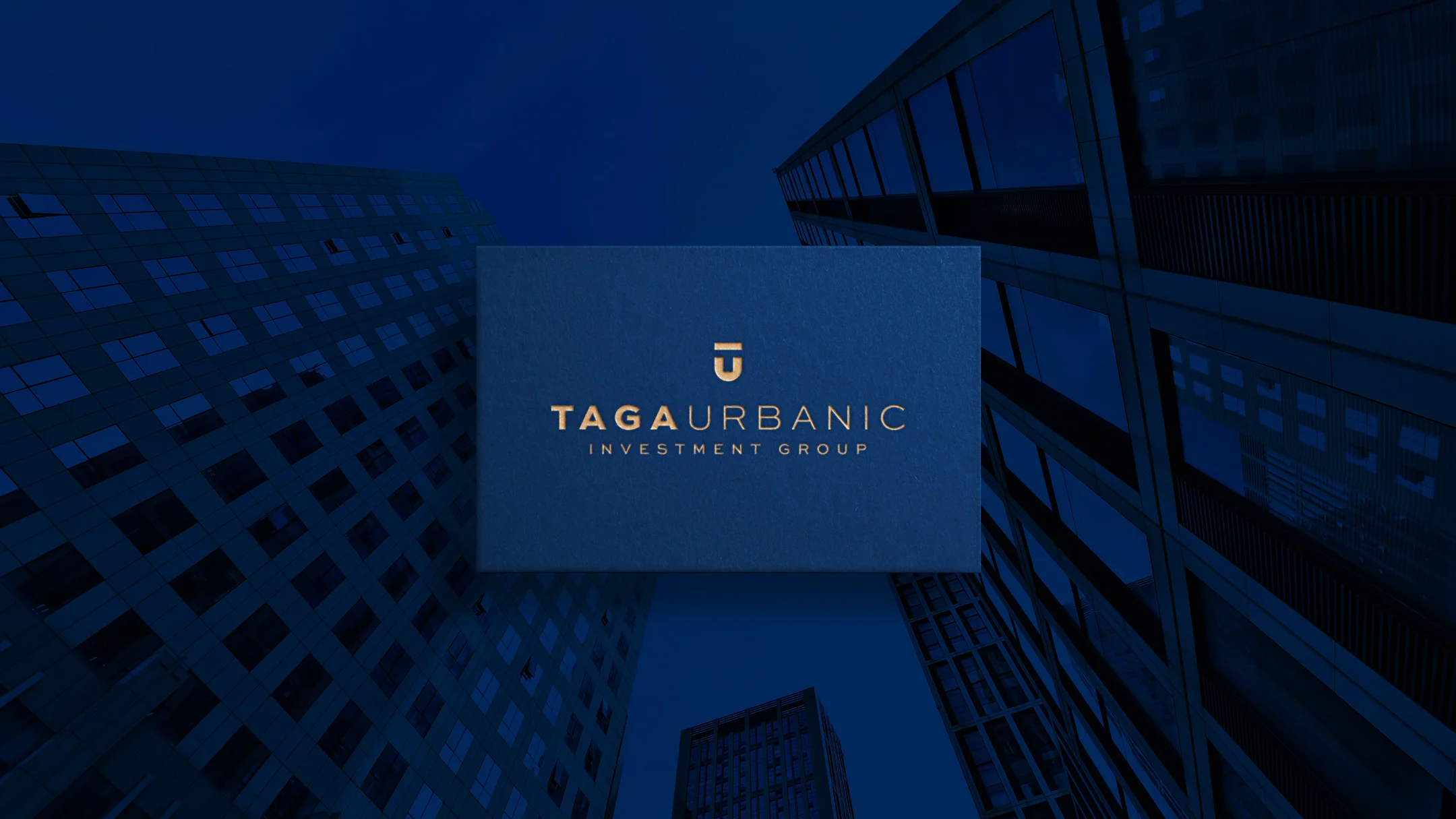
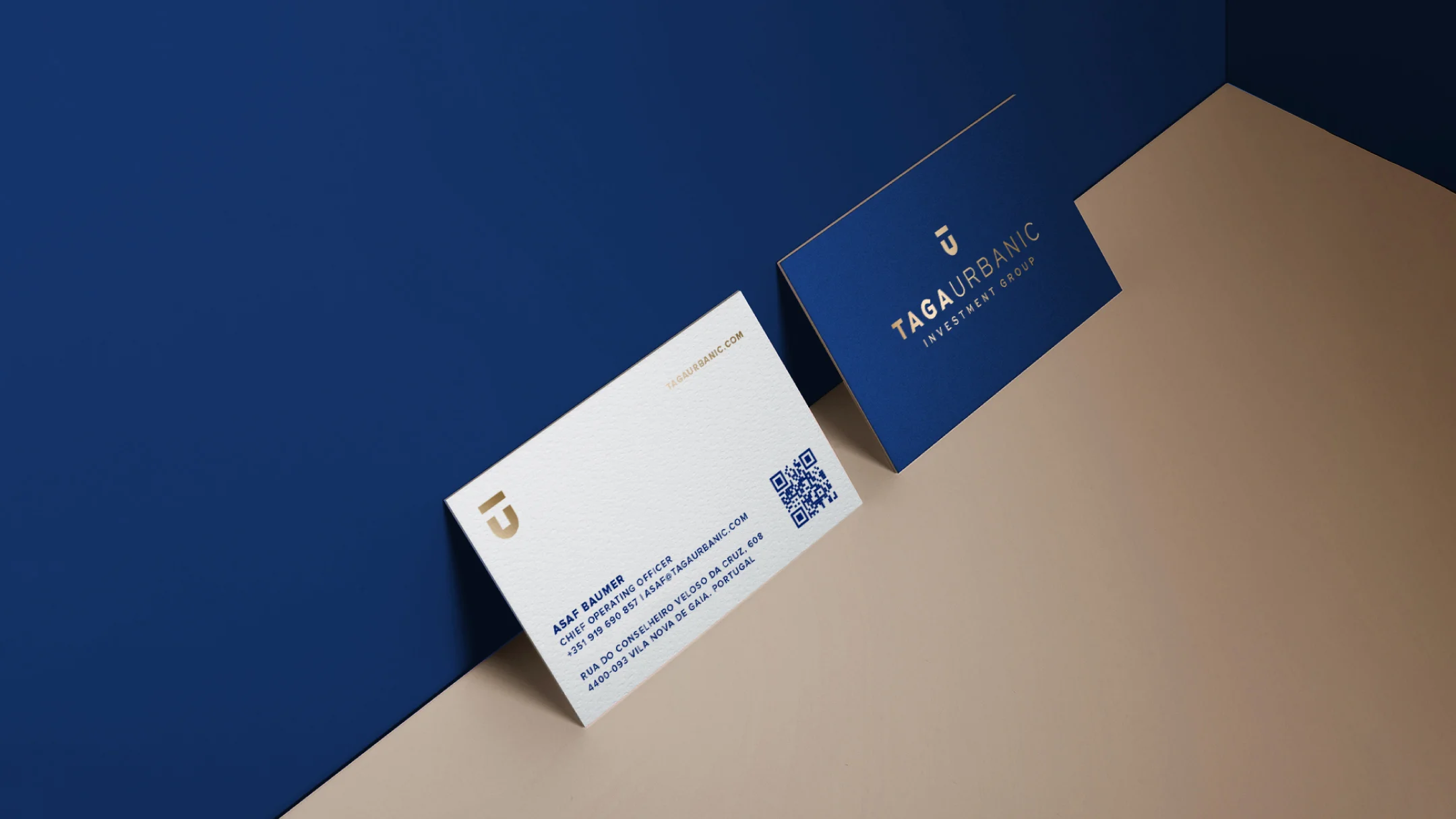
Taga Urbanic
Vila Nova de Gaia, 2021
Global Vision. Solid Investments
Description
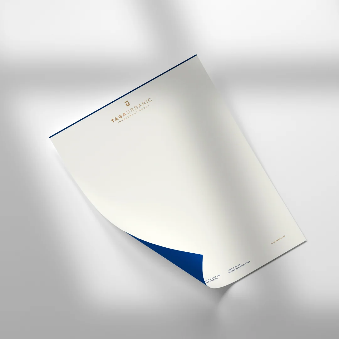
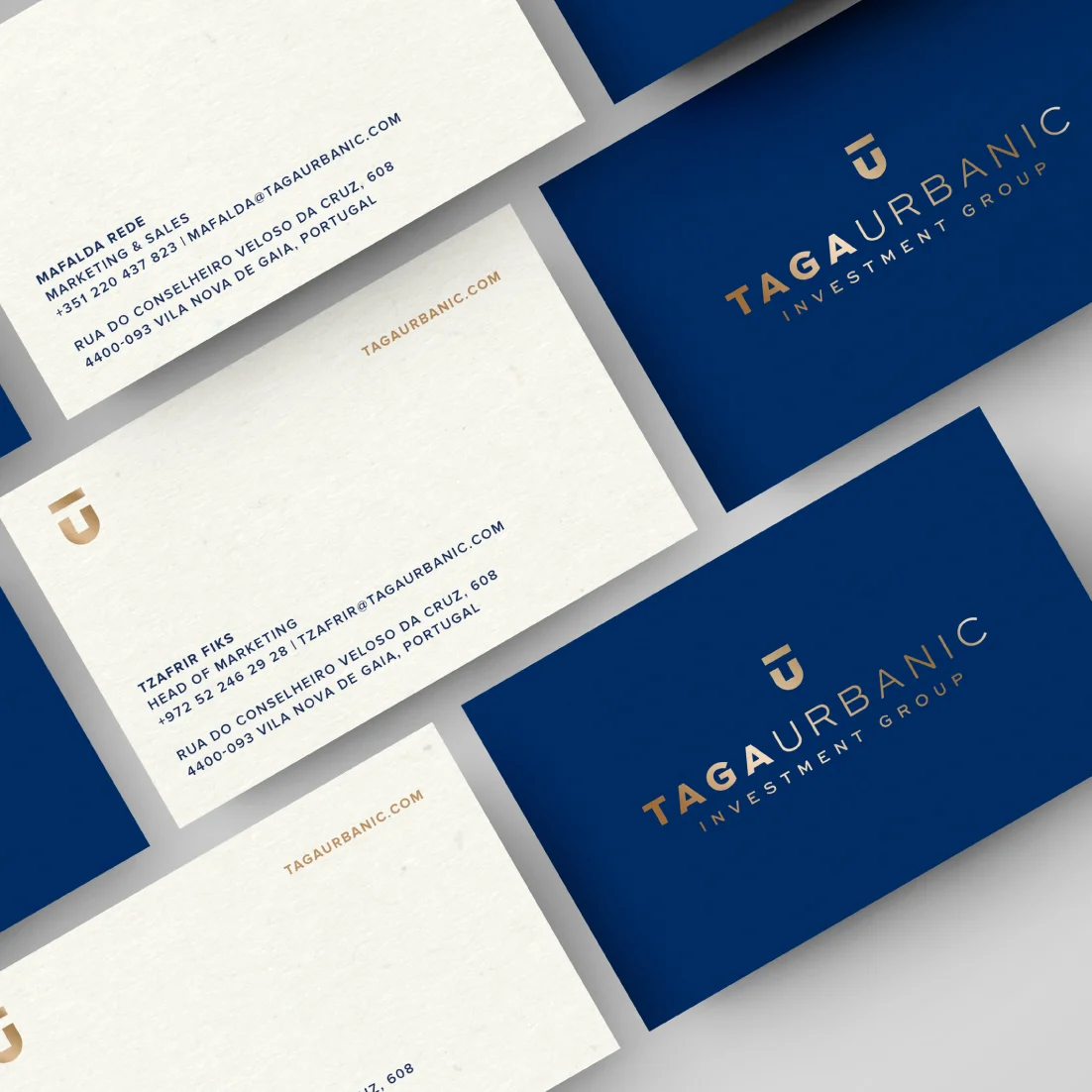
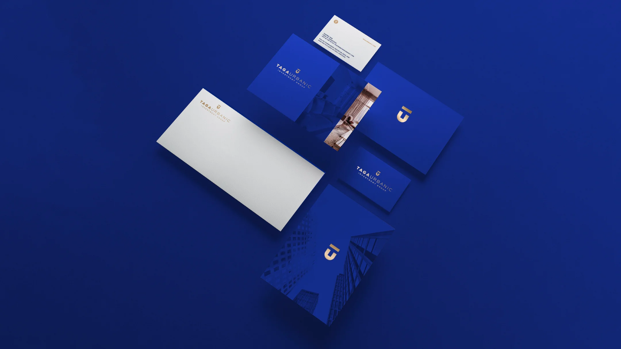
Taga Urbanic’s rebranding marks a strategic transformation, reflecting the brand's global vision and extensive experience in the real estate sector. With a geometric logo featuring simple, precise lines, the new identity combines visual balance and contemporary sophistication while preserving the essence and credibility that define the company. The color palette, in deep blue and gold tones, conveys trust, value, and excellence, aligning with Taga Urbanic’s commitment to delivering high-standard projects and driving growth in the Portuguese and international markets.
-
Pantone 661C
C: 100
M: 61
Y: 0
K: 43R: 0
G: 56
B: 145#003891

-
Pantone 872C
C: 0
M: 17
Y: 38
K: 30R: 178
G: 148
B: 111#b2946f