ON
Porto, 2025
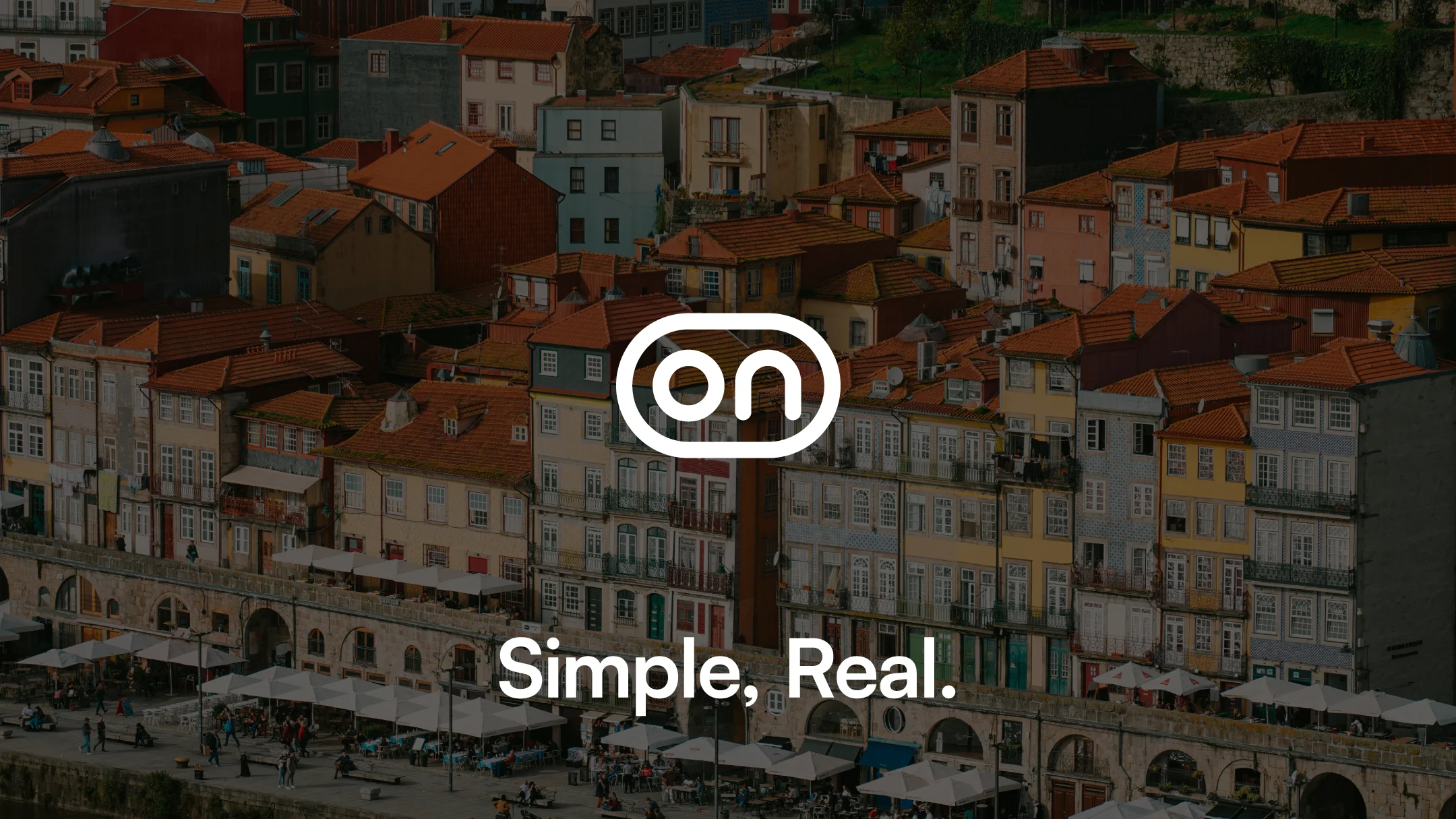
Simple, Real.
Description
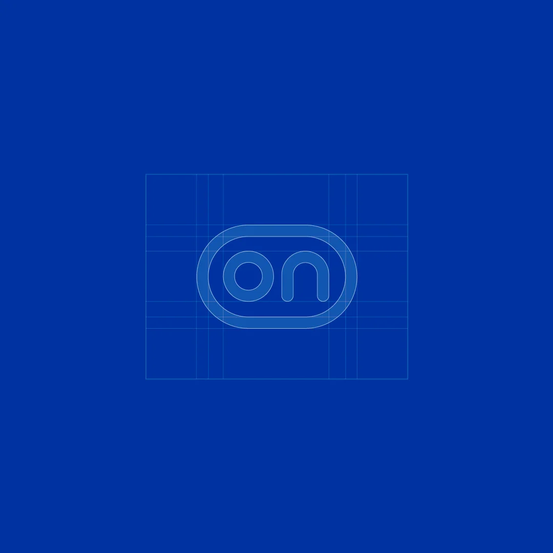
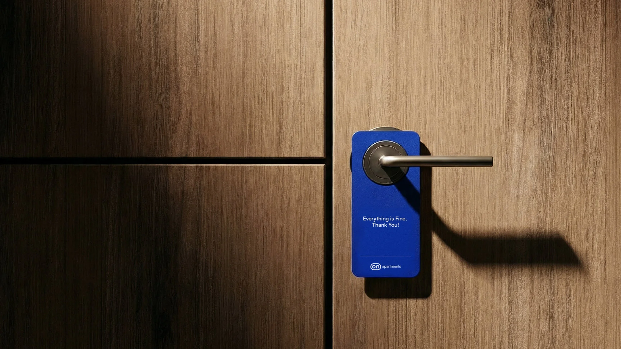
ON is born from a simple gesture: to connect. Like a digital button, it is the moment when everything starts to work. More than a name, it is an attitude — a brand that embraces complexity in order to deliver simplicity, that organises, solves, and anticipates, so that on the other side there is only a smooth, safe, frictionless experience.
At nhdesign, we repositioned ON into a more human, direct, and confident territory, building a clear and approachable language, free from excessive formality or technicality. The core concept, Simple. Real., translates into a brand that speaks plainly, conveys calm through simplicity, and delivers exactly what it promises.
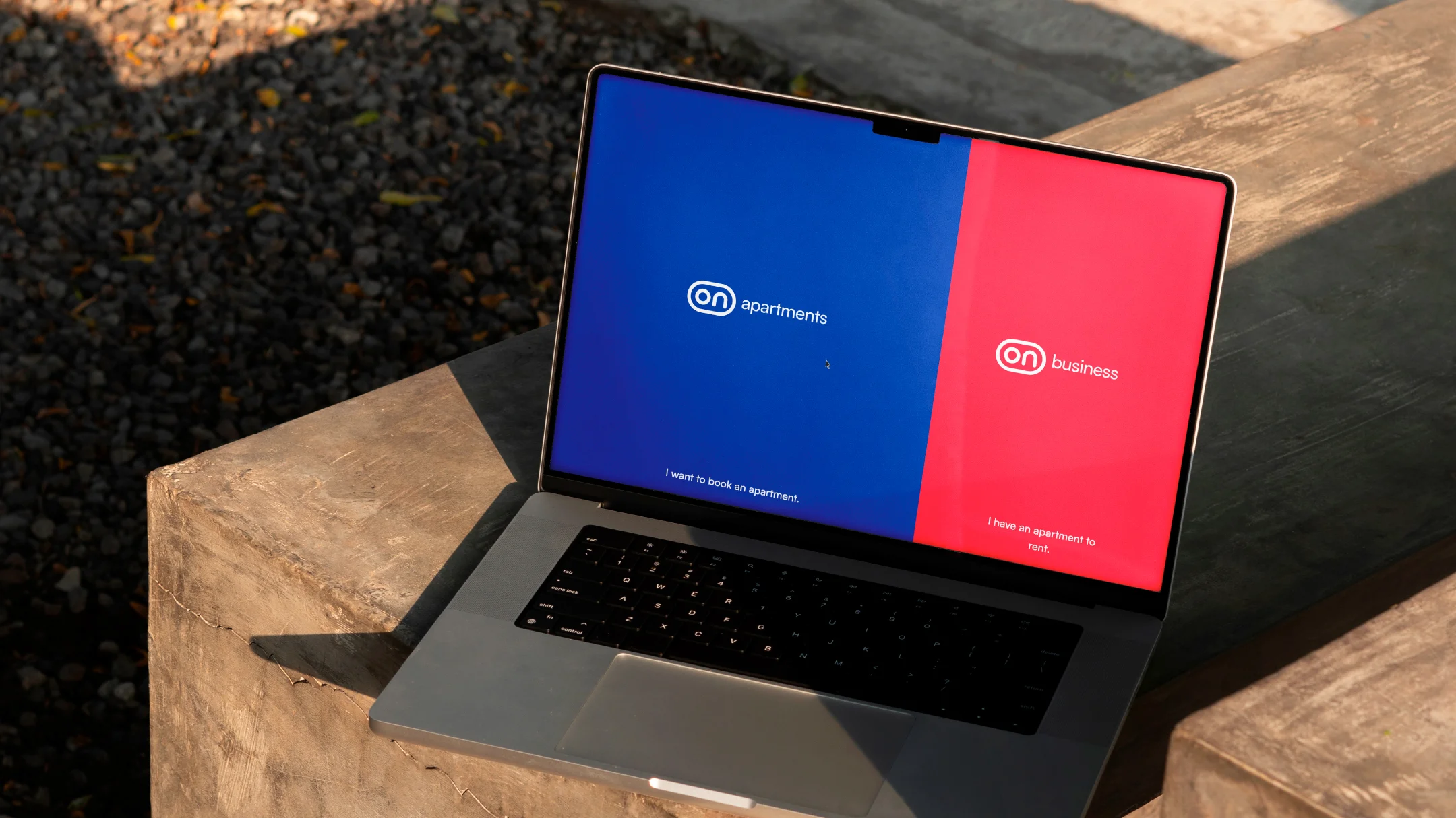
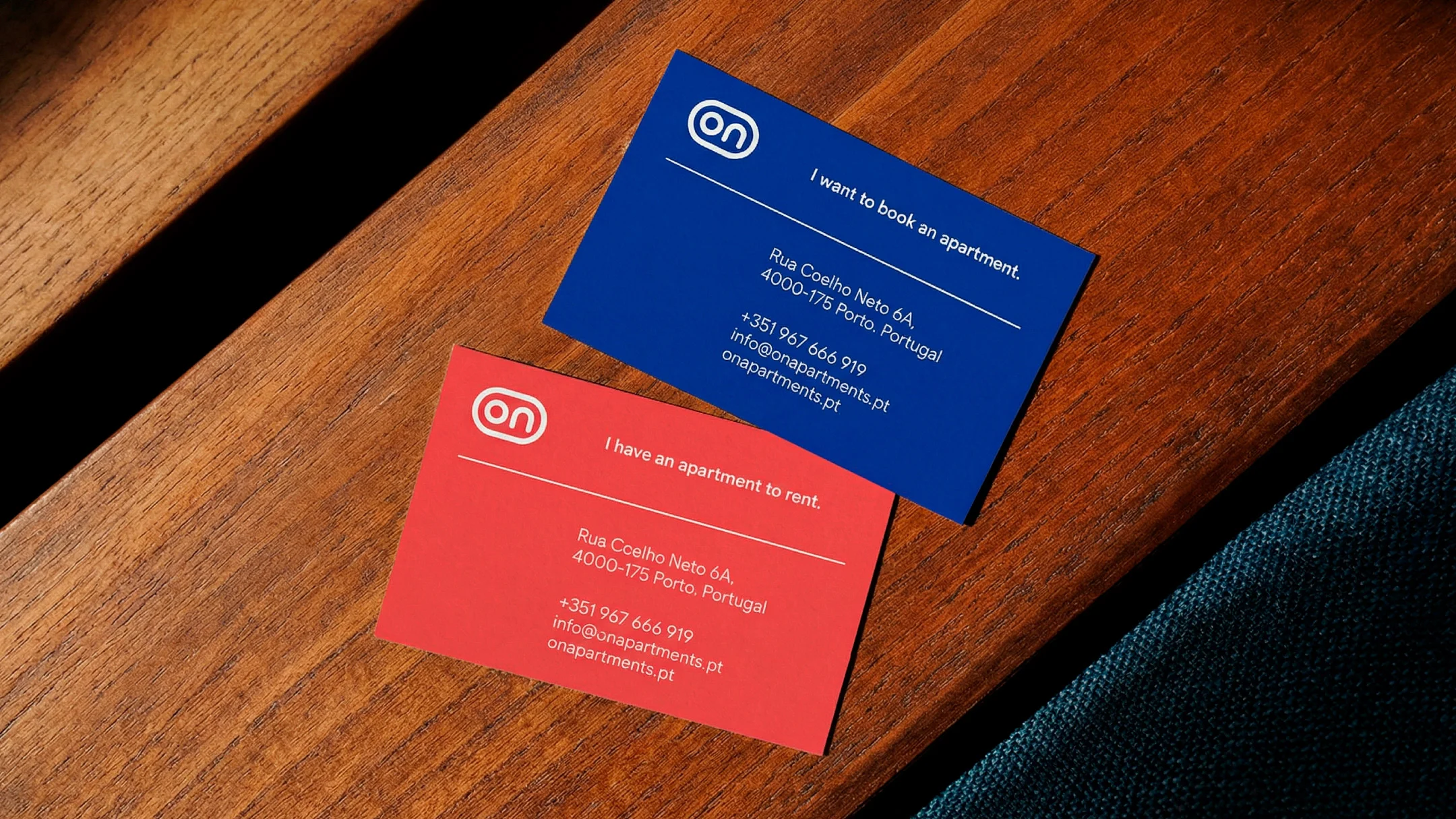
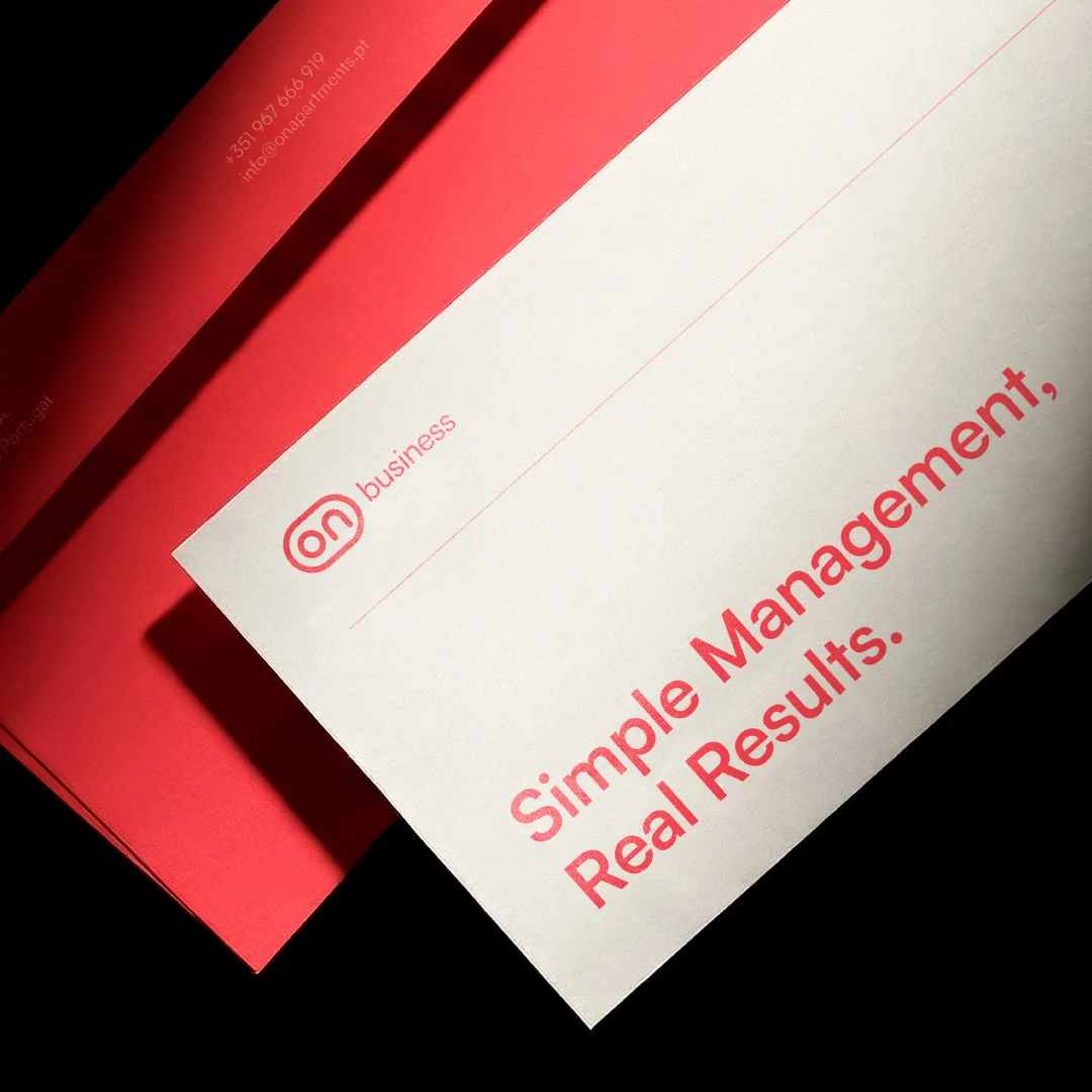
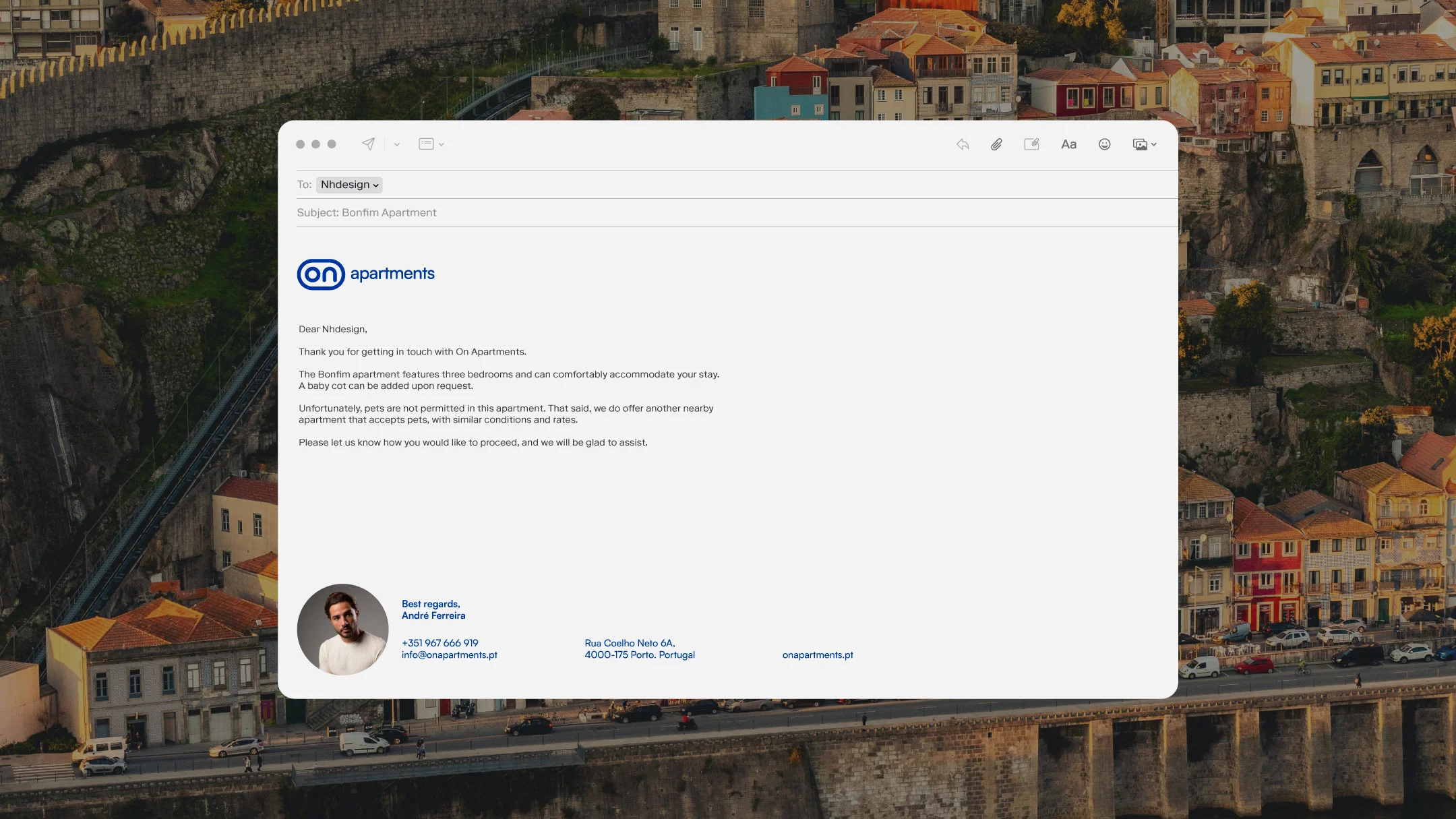
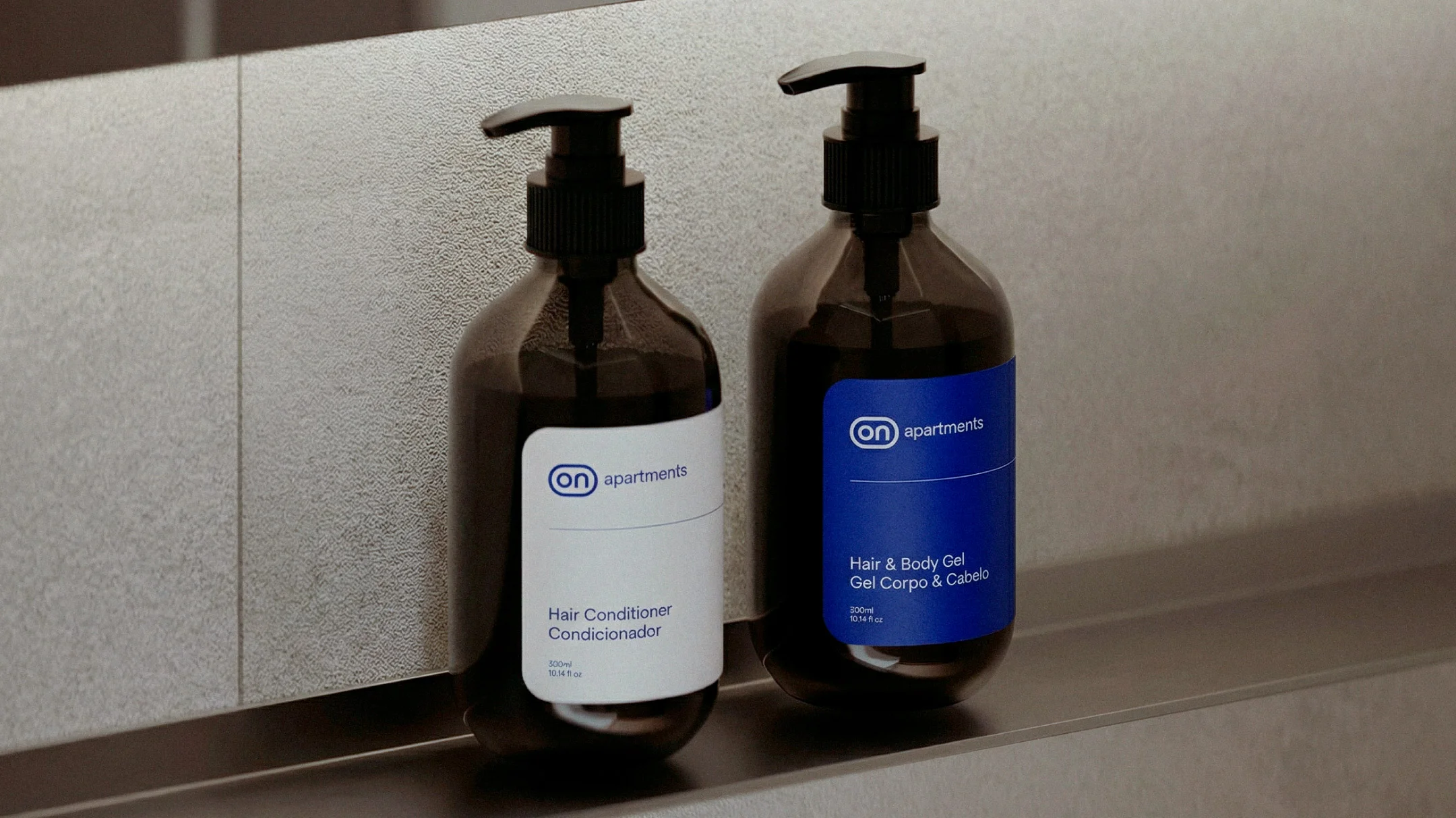
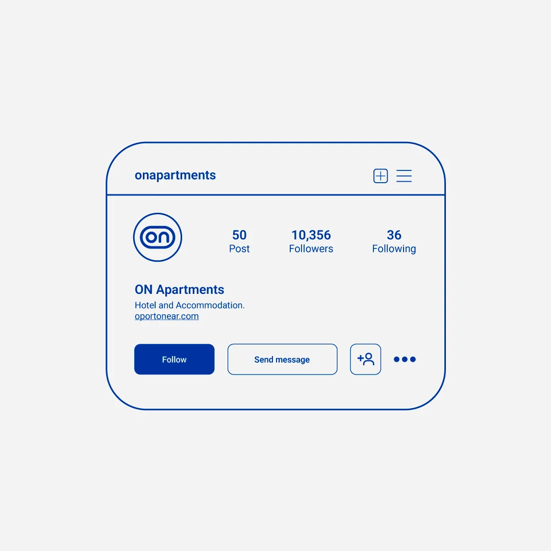
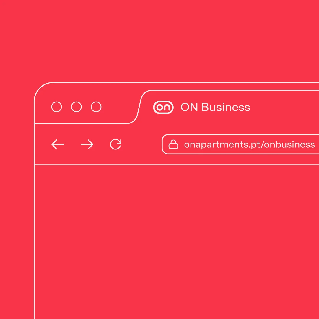
This vision unfolds into two complementary branches — ON Apartments, designed for those who want to experience the city with comfort and peace of mind, and ON Business, aimed at those seeking efficient, transparent, and results-driven management. Visually, this duality is expressed through distinct colour codes that organise different audiences within a single, cohesive identity.
The entire brand is built on a clear principle: simplicity with intention. Direct, functional, noise-free communication that builds trust and creates a real experience, designed to work in the real world. ON is clarity, it is presence, it is always on.
-
Pantone 286 C
C: 100
M: 68
Y: 0
K: 37R: 0
G: 51
B: 161#0033a1

-
Pantone 1787 C
C: 0
M: 74
Y: 67
K: 11R: 226
G: 59
B: 75#e23b4b
-
Pure White
C: 0
M: 0
Y: 0
K: 0R: 255
G: 255
B: 255#ffffff