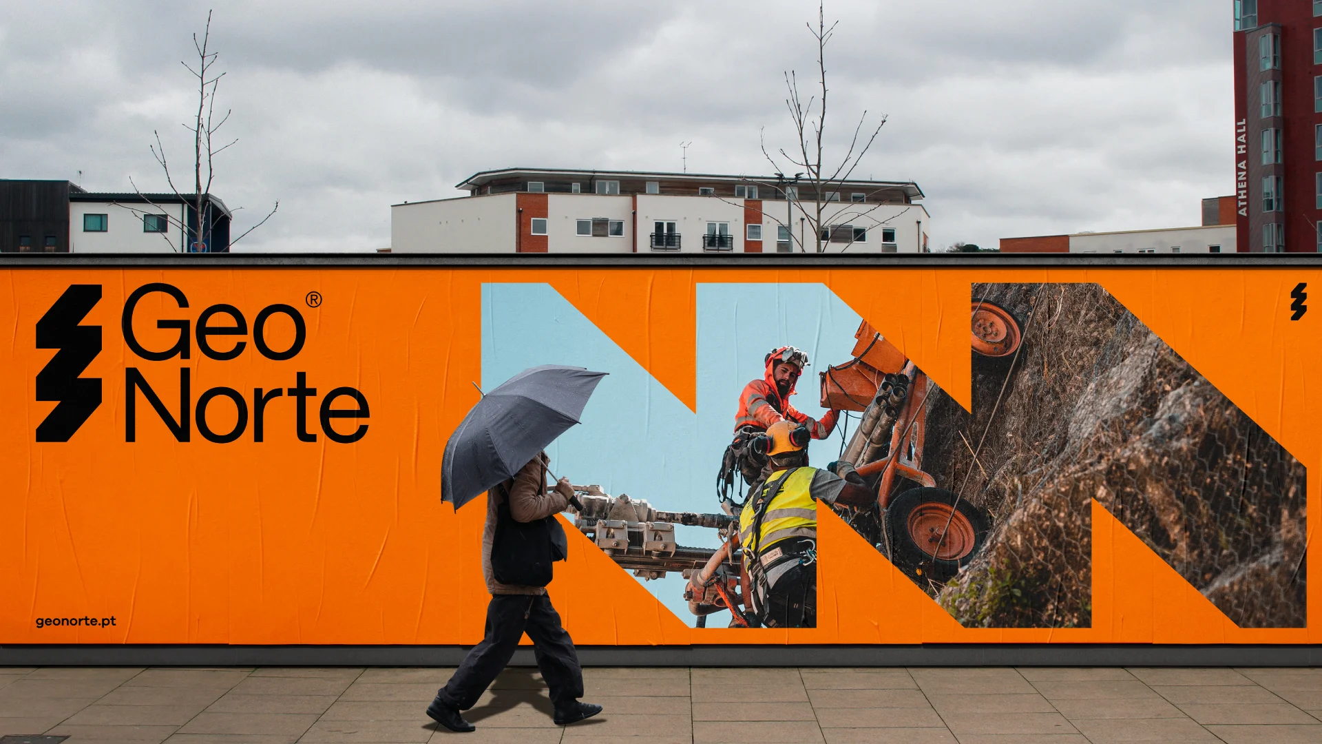
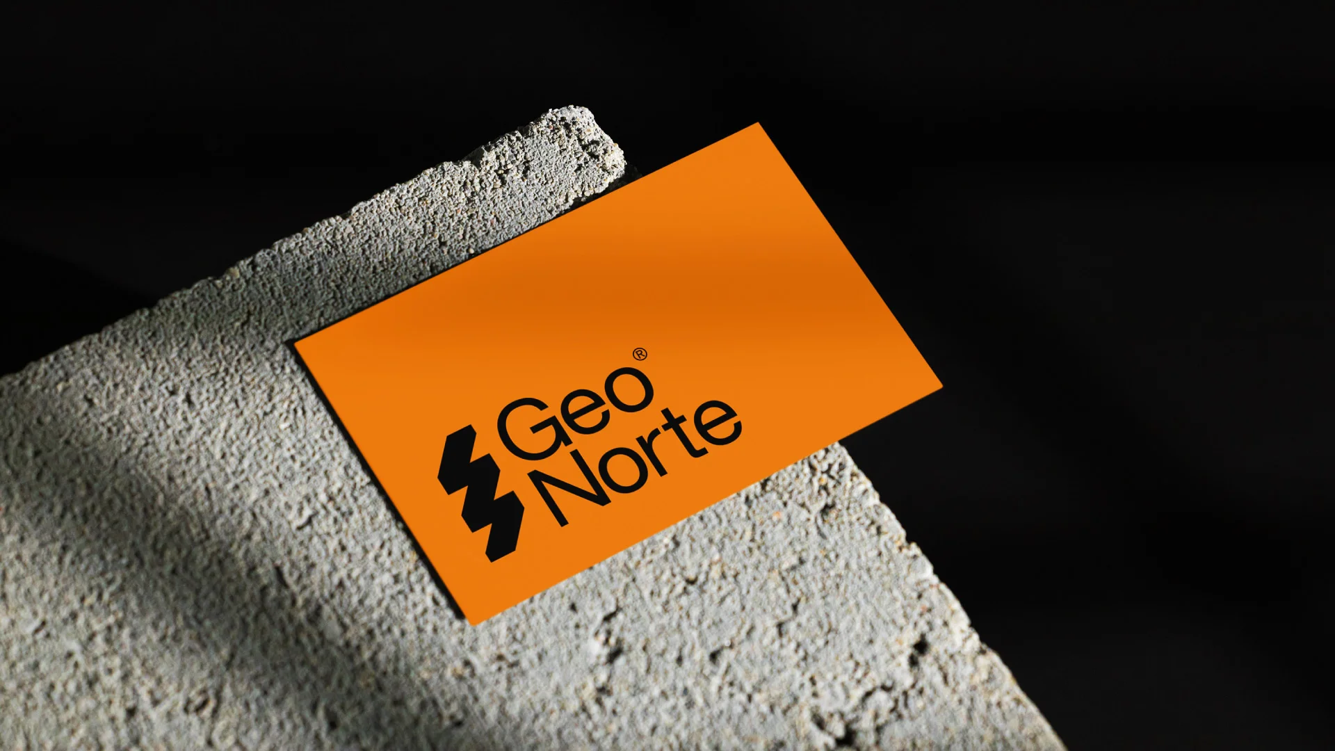
Logo da Nhdesign
Highlight do projeto GeoNorte da Nhdesign

GeoNorte

Porto, 2023

Expertise in the field of geotechnical engineering and special foundations.

  • Branding
  • Rebranding
Imagem principal do projeto GeoNorte da Nhdesign

Description

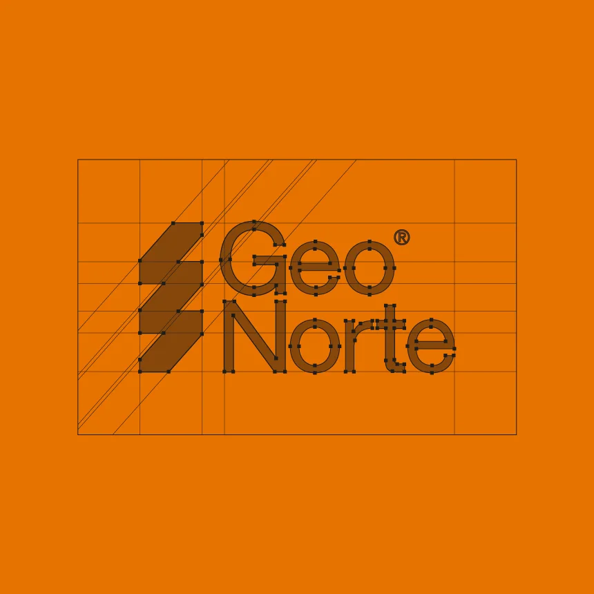
The Rebranding of GeoNorte logo is a testament to its legacy. The logo, inspired by soil layers and the silhouette of a drilling rig, visually represents GeoNorte's commitment to technical excellence and its ability to meet market demands. The typography's geometry adaptation reflects dedication and commitment to being at the forefront of innovation, while maintaining the original color preserves the brand's essence. This new visual identity positions GeoNorte as a benchmark in the industry, ready to tackle challenges and achieve success.

  • Pantone 152C

    C: 0
    M: 51
    Y: 100
    K: 9

    R: 232
    G: 114
    B: 0

    #e87200

  • Geonorte White

    C: 0
    M: 3
    Y: 5
    K: 6

    R: 239
    G: 232
    B: 226

    #efe8e2

  • Pantone BlackC

    C: 0
    M: 0
    Y: 0
    K: 100

    R: 0
    G: 0
    B: 0

    #000000

Nhdesign project GeoNorte: GeoNorte logo on a white background
GeoNorte logo on a white background
Nhdesign project GeoNorte: Construction grid of GeoNorte logo
Construction grid of GeoNorte logo
Nhdesign project GeoNorte: Envelope and letterhead with applied example
Envelope and letterhead with applied example
Nhdesign project GeoNorte: Construction helmet with the brand applied
Construction helmet with the brand applied
Nhdesign project GeoNorte: Brand letterhead and pen with company information
Brand letterhead and pen with company information
Nhdesign project GeoNorte: Geonorte billboard
Geonorte billboard